How to make a glowing edged button
Inspired by this CodepenBeautiful right? Let's recreate it to learn how it works
The basic idea is, take button, add a div to it to hold the glowing lines, generate SVGs the same size as the button, add some strokes, color and blur the strokes to make it look glowy, then animate their position.
First we create an SVG and then create a rectangle that will fill the svg.
Let's make this one a random rectangle, sized 250 x 200 with a radius of 5
But we don't want a random rectangle, we want it to match our button exactly.
So we get the button height, width, and border radius and pass that to where we make the rectangle, so it matches the button exactly.
To get height and width we can use offsetWidth and offsetHeight, which returns the size of a rendered HTML element.
Getting the border radius is a little harder. We need to use style = getComputedStyle(button), and then style.borderRadius to get that number from our element.
Once we have those, we can use them to make an SVG rectangle exactly the same size as our button.
Next we make a new div which will contain our glowing lines. I gave this div a temporary blue background, and size of 50 x 50 just so we can see it.
Now remember our SVG rectangle? Now we add our rectangle (white) into the glowing lines div (blue).
We don't set a width or height on the div now, since divs will grow to fit their contents.
I did add a 1px padding so we can still see the colors of the div.
Now lets add a stroke to our rectangle. Black so we can see it.
The divs are still there, but I'll remove the padding and background color so we can see the stroke better.
Notice that our stroke is getting cut off.
This is because strokes are centered on the object edge, and extend both into, and outside of an object.
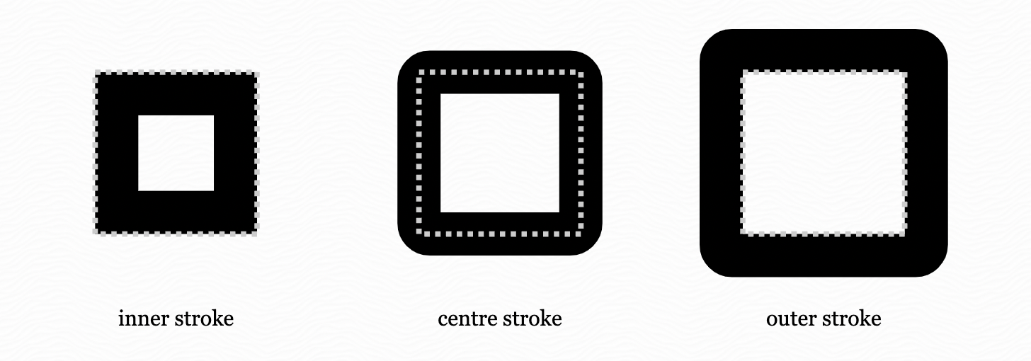
Normally is something spills outside of an object, it is hidden. But we can control this with the CSS property.
overflow: visible;
Let's add that property to our rectangle so the stroke doesn't get cut off.
That is looking better! We don't want a stroke around the whole rectangle, we want a partial stroke that we can move around.
The CSS property stroke-dasharray is here to help. Using stroke-dasharray we can specify the lengths of the dashes, and gaps in a stroke, which then repeat around the shape.
If we want our dashes to be 2, and our gaps to be 3, we can add a stroke-dasharray to our rectangle using:
stroke-dasharray: 2 3;
Now you may wonder, why is there only 2 dashes around the rectangle? If the rectangle perimeter is about 600, (200 length + 50 height + 200 length + 50 height) why isn't there hundreds of dashes of length 2, with gaps 3?
The answer is pathLength. Pathlength specifics how long a path is in relative units.
Example: a mountain hike is 5 miles, but you say the path length is 10 units, and you tell the CSS to hike 2 units of the path. The browser will calculate how far to hike (aka draw a shape) based on the path length. In this case 2/10 = 0.2
0.2 x 5 miles is 1 mile. So the hike could be any length, but if you set the pathlength to 10, and say hike 2 units, it will always be 20% of the total length.
Since we want to apply this effect to any button, we don't know how big the button is going to be. By setting a path length and specifying the stroke-dasharray we can make the effect look the same on any type of button.
So we have our partial stroke. Now we need to first make it glow, then make it move.
It is hard to make something black glow, so let's change the color to something more glowy.
Lighter colors already have more luminence. Also we don't want a user to be able to click on the div, as it is just decoration, so lets set:
pointer-events: none;
There are two more things that sell a glow, blur, and mix modes. We will tackle blur first.
If we add blur it looks like the light is leaking out, which we want. CSS has a couple of built in filters and blur is one of them. The large the number, the more blurry it is.
Let's add make our stroke wider, and add a blur to our rectangle with:
			stroke-width: 5px;
  			filter: blur(6px);
This blurs the whole rectangle, fill and stroke included. We only want the stroke blurred.
To do this, we need to remember that the rectangle is just for the glowing outline, around the button. So lets remove the fill of the rectangle to so just the stroke is left.
That worked but now it is just glow. We want a solid inner light, that throws off a glow. We can get that by layering stroke rectangles with different sized blurs together.
Let's add a solid no blur rectangle stroke for the core, then a small blur rectangle for some glow.
Since we want them to overlap, we will have to change display to block and position them absolutely. However, the blurs won't end up in a crazy place on the page (which can happen with absolute positioning, since abosolute is in relation to the first parent positioned relatively. Since the blurs are contained in our div, which is contained by our relatively placed button, we can safely use positioning absolute.
.noBlurCore {
	display: block;
	position: absolute;
	stroke: #f8fcff;
}

.smallBlur {
	display: block;
	position: absolute;
	stroke-width: 5px;
	filter: blur(6px);
}
That is looking glowly. Let's add in our button and pump up the effect by layering on top of it a medium blur glow, and big blur glow.
	.mediumBlur{
		stroke-width: 6px;
		filter: blur(20px);
	}

	.bigBlur {
		stroke-width: 10px;
		filter: blur(56px);
	}
Our button has a glowing edge. Now let's move it.
For this we are going to use the stroke-dashoffset property. stroke-dashoffset controls where the stroke actually starts along the path.
Positive numbers pull the stroke start to the left on the path, negative numbers push it to the right.
We want our glow to move clockwise around the button, moving to the right. So if we start the stroke pulled to the left, then move it to the right, we get the clockwise motion we want.
So let's back the stroke up really far to the right by stroke-dashoffset: 14, and then animate it to the right back to stroke-dashoffset: 4.
stroke-dashoffset: 14;

@keyframes animateTheGlow {
	0% {
		/* stroke-dashoffset: 14; we don't have to set this, as 0% uses initial state aka the 14 we already set*/
	}
	100% {
		stroke-dashoffset: 4;
	}
}
We now have an animated, moving, glowing button!
You notice that it jumps because it is hard to make the animation end exactly where the stroke offsets match up. A way to fix this is to just fade it in and out using opacity.
This works well because we want the button to have subtle effects, not a strobe light. So we can add opacity, going from 0 to 1, then back to 0.
You may notice some clipping in different browsers. (Safari mostly.) We can fix this by moving CSS to two different classes.
Looks great! Now we just need to add some javascript to control the animation.
We can add and remove the class to start and stop the animation.
Let's add 3 different triggers. 1. hovering (on Desktop). 2. Clicking or tapping. 3. On mobile small automatic timer if we want it.
So lets add addEventListener('pointerenter', function), button.addEventListener('click', function), and to test if the user can hover
if(window.matchMedia("(hover: none)").matches) {
	//make it glow once at 3 seconds since hover doesn't work on mobile
	setTimeout(() => {button.classList.add("start")}, 3000);
}
And there you have it. A glowing, beautiful button.